There are different ways to plot the price action on a chart.
Although different charts present the same thing, they visualize it in a different way.
They can provide a whole lot of price characteristics, or just a clean look. It is also a matter of personal preferences, as so much things on the chart are adjustable.
There are three types of charts to display the price action that are used in technical analysis.
Line chart
The simplest one is the line chart. Every period is represented by a dot, that usually denotes the closing price. The dots are connected to form a line.
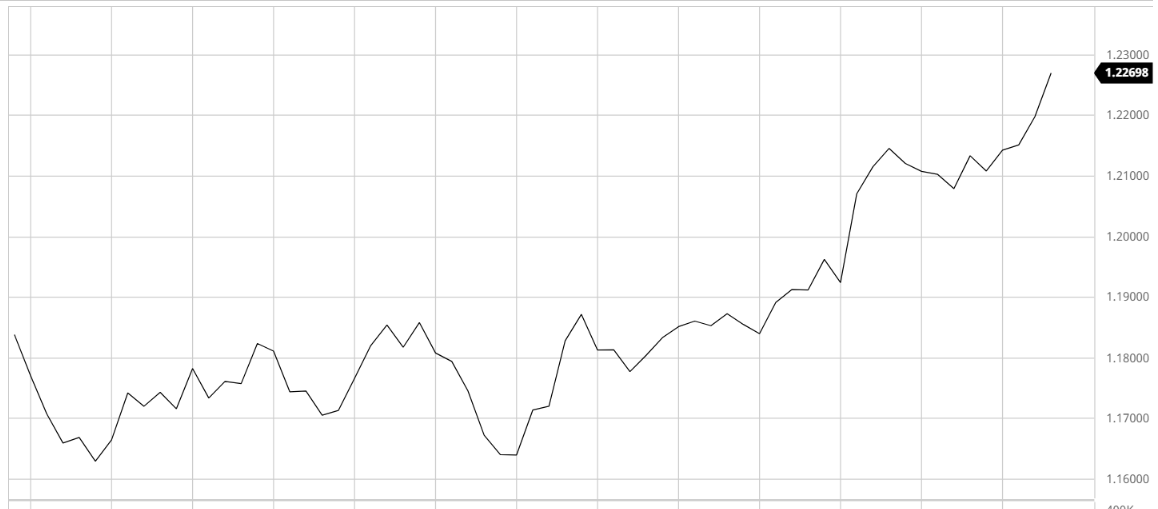
Though it does show the movement of the asset for the period, the information it provides is very limited. It gives a clear “big picture” so it can be used to monitor the trend for a period.
Bar chart
The bar chart contains a lot more information than the line chart.
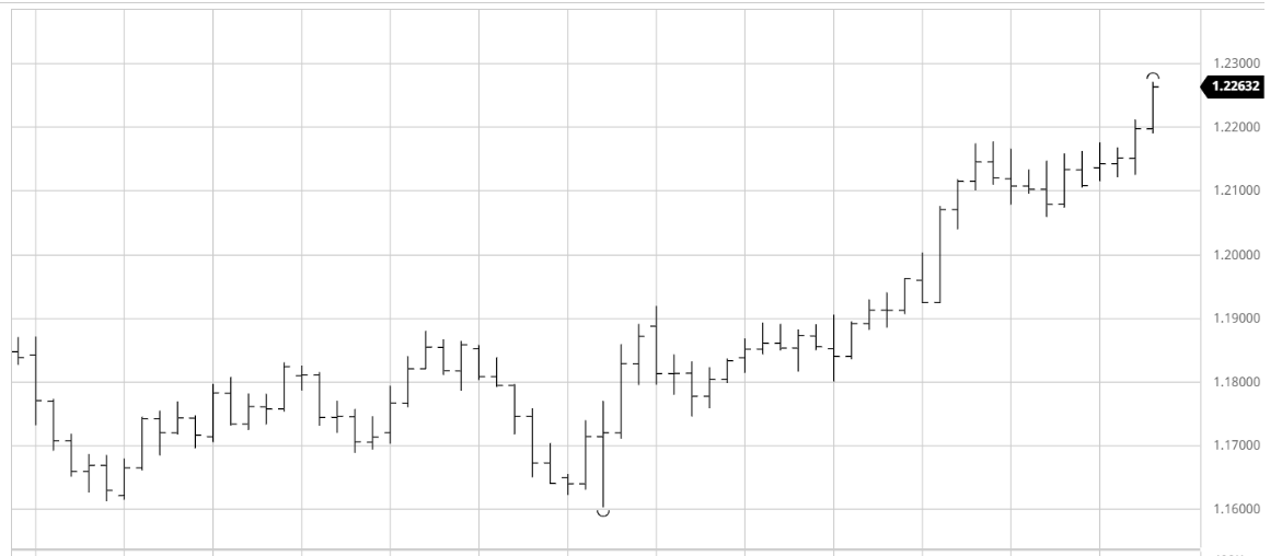
It shows the trend but there is also information about the opening and closing prices, as well as the highest and lowest prices for each period. Every period within the chart is represented by one bar.
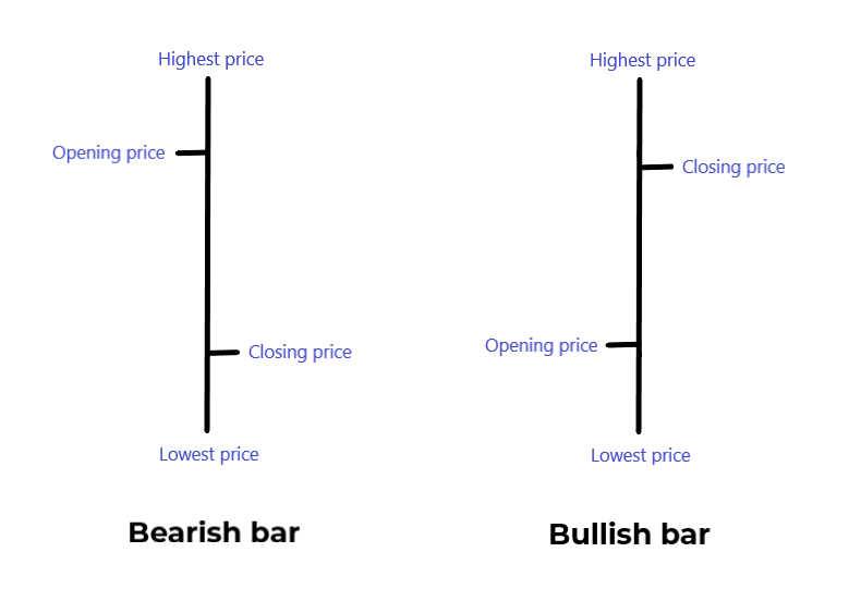
The more volatile the period, the longer the bar. And the opposite, if the price did not fluctuate that much, the bar will be shorter. The left horizontal line indicates the opening and the right horizontal line – the closing price of the period.
If the opening price is higher than the closing price, the bar is called Bearish bar. If the opening price is lower that the closing price, the bar is Bullish.
A bar can represent a different time period, depending on the bar chart you look at. It can contain the price moves of the asset for a minute, an hour, a day – it is all a matter of choice.
Candlestick chart
Perhaps the most widely used type of chart is the candlestick chart. It contains the same information as the bar chart but is considered more visual because of the colored and thicker real bodies, which are better at highlighting the difference between the open and the close.
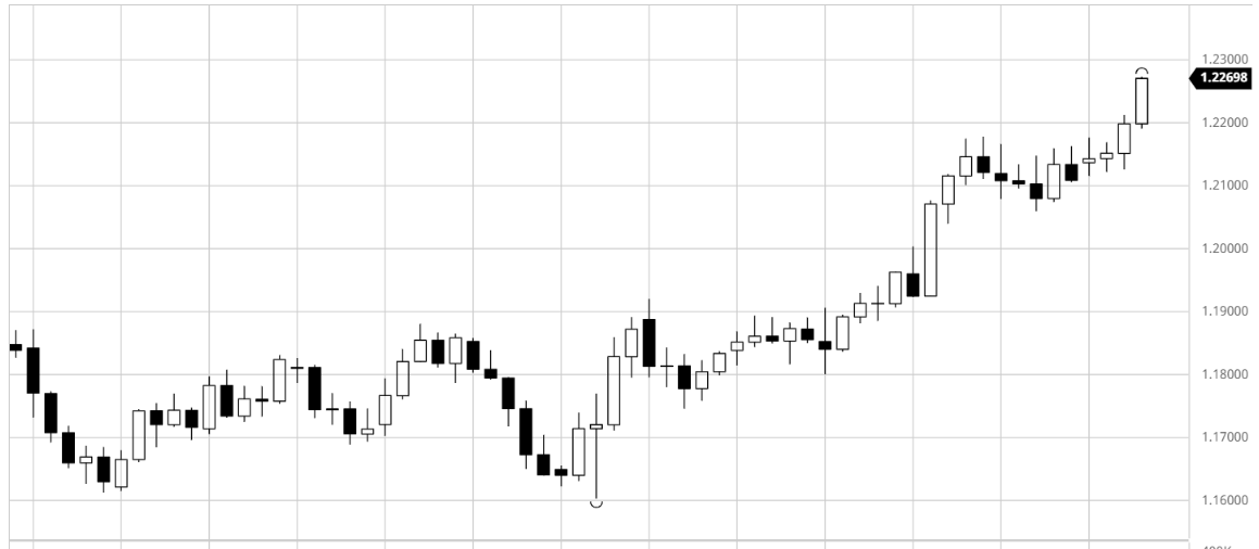
Black and white candles is the standard look of the candlestick charts. Still, for those who fancy the alternative ways, there are more colorful charts.
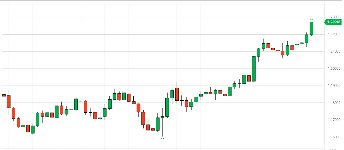
Every period within the chart is represented by one candlestick. It provides information about the opening and closing prices, and the highest and lowest prices for each period, just like the bar. The period that the candle represents is adjustable. It can be 1 minute, 5 hours, or 3 months, the choice is in the traders’ hands.
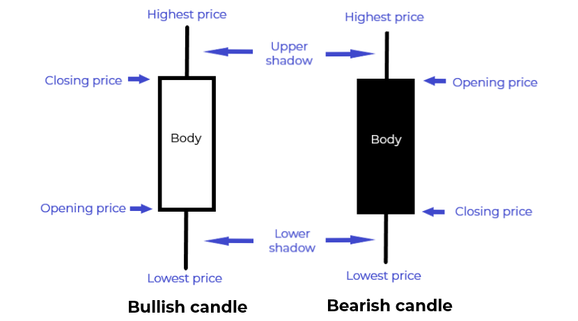
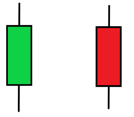
The body (or the real body) marks the range between the open and the close for the period. If the body is white (or green), the candlestick is considered bullish. The bullish candle shows that the price has risen during the period and the opening price is lower than the closing price. The close, in this case, is said to be strong.
The black (or red) body shows that the price has fallen during the period and the opening price is higher than the closing price. The close is said to be weak and the candle is called a bearish candle.
The upper and lower shadows mark the highest and lowest prices for the period. The longer the shadow, the more volatile the price within the period. This shows a period of uncertainty. A long body, on the other hand, shows that the bulls (if the candle is white/green) or the bears (if it is black/red) dominated during the period.


