Technical indicators are mathematical calculations, based on price or volume, that are used to evaluate the short-term state of the market and to indicate its possible development. There are indicators that use the same chart scale as the price and are plotted together with the price action. They give a different perspective of the price movements. Other indicators oscillate between a local minimum and maximum. They provide additional data about the development of the price.
There are hundreds of indicators. Traders must choose those that work best for them and familiarize themselves with how they work.
A very good option is to combine several indicators and use them together to provide good trading signals.
TREND-FOLLOWING INDICATORS
The trend-following indicators are used to identify the existence of a trend and measure its strength, direction and development via some form of price averaging.
Generally, if the price is above the average the trend is considered bullish, and if it is below it, it is considered bearish.
Here are some of the most common trend indicators.
MOVING AVERAGES
The moving average (MA) is one of the simplest, yet most widely used trend-following indicators. It aims to smooth the price action, by eliminating random spikes, this way giving a better view of the overall trend.
MAs show the trend as it has developed so far, without giving any predictions about the future. This task is left to the trader, who can make his decision based on the MA’s results.
There are different types of MAs. Depending on the calculated periods, they can be 5-period, 10-period, 20-period, 50-period, 200-period, or whatever other period the trader needs.
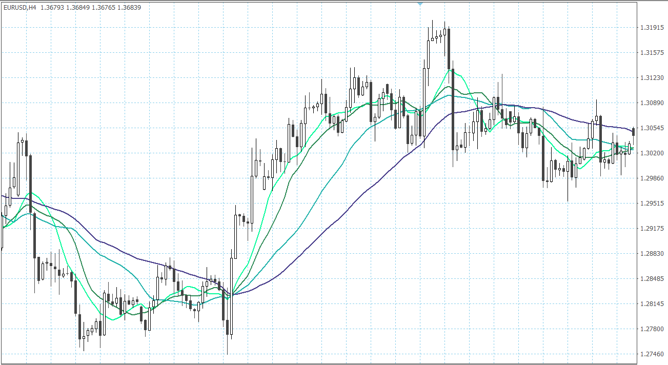
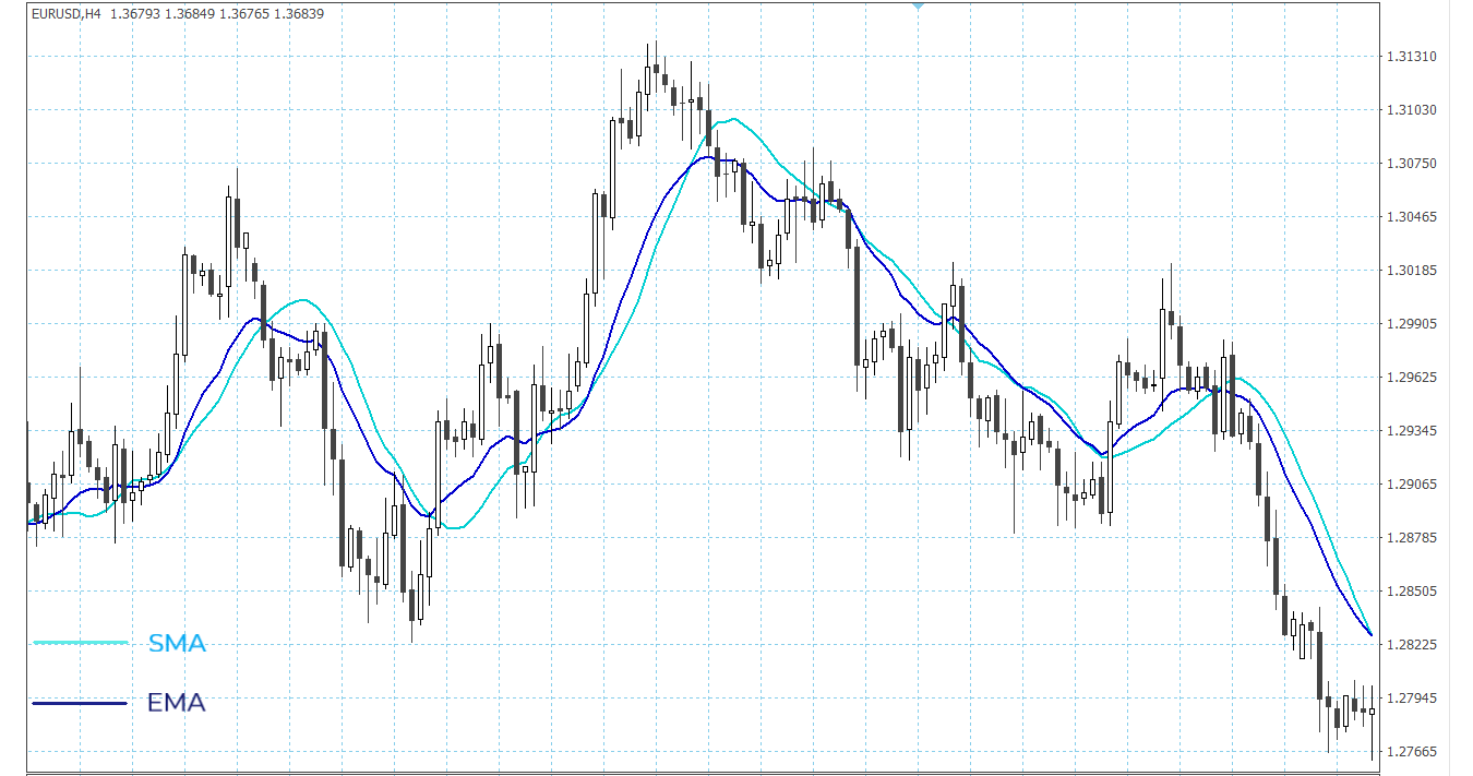
Depending on the calculation method, the two most commonly used types of MA are the Simple Moving Average (SMA) and the Exponential Moving Average (EMA).
Simple Moving Average (SMA)
As the name suggests, this is the simplest type of MA. It is calculated (if we take the 5-period MA) by adding up the closing prices of the last 5 periods from the chart and dividing that by 5. This gives us the first point of the MA’s line (from right to left).
We then move one period back and once again add up 5 periods and divide them by 5. This gives us the second point of the MA’s line. And so on.
The longer the period, the smoother the moving average. SMAs with longer periods react less to the price changes. They provide a broader view of the market and show the general trend.
Plotting two or more SMAs with different periods helps assess the current trend. We can assume that an uptrend is still going strong if the faster SMA, which is typically closer to the price action, is higher than the slower SMA. And the opposite for a downtrend. If the faster SMA is below the slower one, the downtrend still has momentum.
Exponential Moving Average (EMA)
The Exponential moving average (EMA) is calculated by giving more weight to the most recent periods. This eliminates one important drawback of SMAs. A sporadic price move, like the release of some surprising news, would change the SMA (especially the fast ones) quite a lot. It may give out a wrong signal that the trend is ending, for example.
It makes sense to put more value on the recent periods. The EMA is more sensitive to the most recent price changes and can follow the price more closely. It is much more important to know what traders are doing now, rather than what they were doing a week ago.
BOLLINGER BANDS
The Bollinger bands are used to measure the market volatility. They help determine oversold and overbought areas and confirm divergencies between the price and the indicators.
It consists of three lines (bands) plotted on the price chart. The middle one is usually a SMA with a period of 20 days. It serves as a base for the calculation of the upper and lower bands. They are usually adjusted to 2 standard deviations (above and below) from the SMA, though this is a matter of preference.
The bands tighten when the price volatility is low. This indicates that a sharp price move in any direction is possible. If the price is very volatile, the bands widen. This might mean that a trend is ending.
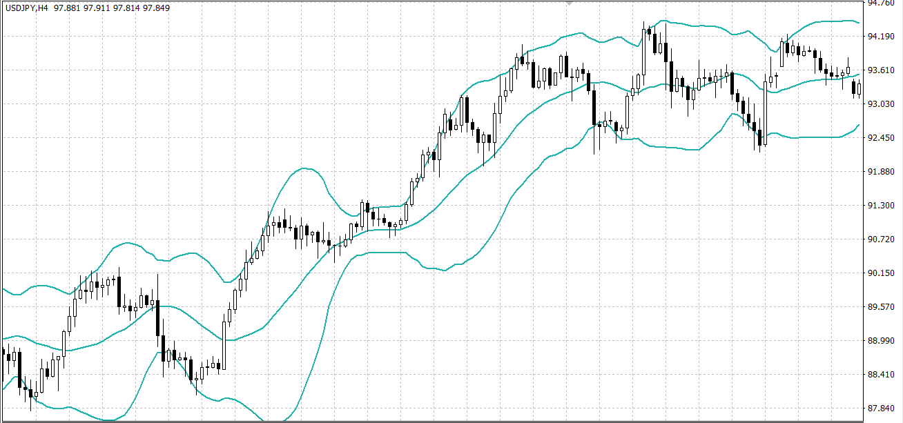
When the price moves closer to the upper band, the currency pair is becoming overbought, and when it moves closer to the lower band, the currency pair is becoming oversold.
AVERAGE DIRECTIONAL INDEX (ADX)
The ADX is used to measure the strength of the trend. It does not show whether the trend is bullish or bearish, but it can indicate when a ranging market is beginning to develop a trend.
ADX fluctuates between 0 and 100. Low readings indicate a weak trend (or a ranging market), and high readings indicate a strong trend. No matter whether the trend is upwards or downwards, higher ADX levels show that the trend has momentum. Lowering levels mean that the current trend is losing steam.

PIVOT POINTS
Pivot points are a popular method for identifying potential levels of support and resistance. They show levels that are likely to turn the price the other way and are a tool of the short-term trading.
The pivot points are a good way of plotting support and resistance levels because they are objective. They give a precise price level, unlike some other methods that could be subject to interpretations. Furthermore, pivot points are used by many traders who do the calculations (usually) using the same method.
The pivot points are calculated using the last trading session’s open, high, low, and close. Since Forex is a 24-hour market, most traders use the New York closing time (5:00 p.m. EST) as the previous day’s close.
First, we need to calculate the Central Pivot Point (PP):
Central Pivot Point (PP) = (High + Low + Close) / 3
The PP can be helpful when analyzing the price action. If the quotes are above the central pivot, the market is considered bullish. If the quotes are below the central pivot, it is rather bearish.
After we’ve calculated the PP, we can use it as a reference to calculate the levels of support and resistance:
First level of support and resistance:
Support 1 (S1) = (PP x 2) - High
Resistance 1 (R1) = (PP x 2) - Low
Second level of support and resistance:
Support 2 (S2) = PP - (High - Low)
Resistance 2 (R2) = PP + (High - Low)
Third level of support and resistance:
Support 3 (S3) = Low – 2 x (High – PP)
Resistance 3 (R3) = High + 2 x (PP – Low)
There are also intermediate levels, or mini levels, that can further be calculated.
Of course, you do not need to do this on your own. There are charting tools and calculators that can do the math for you in a matter of seconds.
FIBONACCI NUMBERS
The Fibonacci numbers are a sequence in which each successive number is the sum of the previous two. It was discovered by the famous Italian mathematician Leonardo Fibonacci, and as it turned out, the ratios derived from this sequence describe the natural proportions of quite a lot of things in the Universe.
Remarkably, Fibonacci ratios can be used in the analysis of the price action as well, serving as possible levels of support and resistance.
0, 1, 1, 2, 3, 5, 8, 13, 21, 34, 55, 89, 144, 233, 377, 610, 987 ….
This sequence of numbers has many interesting relations. The ratio of any number (excluding the first few) to the next is 0.618 and the ratio of any number (excluding the first few) to the previous is 1.618. This is also called the Golden Ratio and is considered the mathematical word for beauty.
We can calculate the following ratios that are important:
Fibonacci Retracement Levels – 0.236, 0.382, 0.5, 0.618, 0.764
They can also be expressed as a percentage:
Fibonacci Retracement Levels – 23.6 %, 38.2 %, 50 %, 61.8 %, 76.4 %
Although 0.5 (or 50 %) is not a part of the Fibonacci sequence it is a widely used Fibonacci level.
The Fibonacci retracement levels are plotted between two extreme points on the chart as horizontal lines. We must find the major swing lows and major swing highs on the chart. After that, we calculate the main Fibonacci levels.
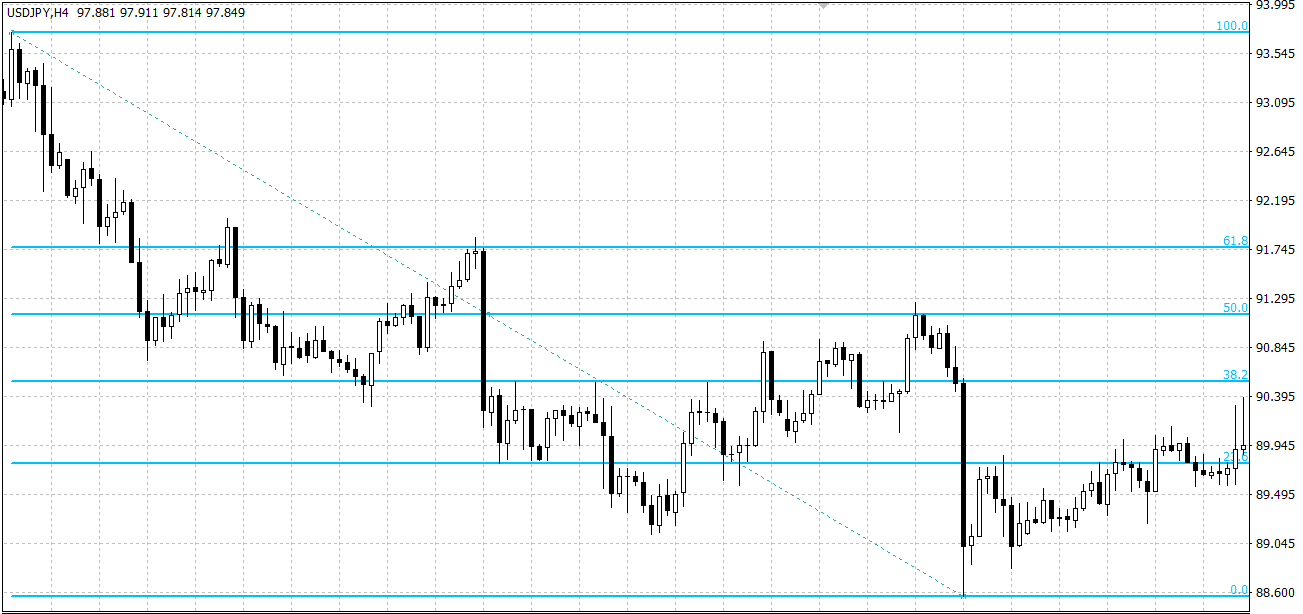
The Fibonacci retracements are used as support and resistance levels. It could be expected that the price moves will change direction around them. In theory, after the price begins a new trend direction, it will retrace back to a previous price level (Fibonacci level) before resuming in the direction of its new trend.
It is not necessary to calculate these numbers yourself, as you can find a Fibonacci tool in any charting software.
OSCILLATORS
The Oscillators are technical indicators that oscillate between a local minimum and maximum. They help detect oversold and overbought conditions.
Here are a few of the most common oscillators.
RELATIVE STRENGHT INDEX (RSI)
This oscillator gauges the strength of the current market. It has a minimum value of 0 and a maximum value of 100. Low readings indicate an oversold market and a possible increase of the price, while high values mark an overbought market and a possible decline of the price.

Another way to use the RSI is to find divergences. When the indicator is moving opposite to the price, this shows that the trend is weakening, and a possible trend reversal could be expected.
COMMODITY CHANNEL INDEX (CCI)
The CCI helps to find cyclical turns and trend reversals in the price. It measures the current price related to an average price for a certain period. The CCI is used to identify oversold and overbought levels.
The CCI was originally created for the needs of commodity markets but is now used for all kinds of financial markets, as all are subject to some form of cyclic development.
The CCI values fluctuate above and below zero. Values high above zero mean that the price is above the average price, indicating an overbought market. Values below the zero line mean that the current price is lower than the average price for the period and that shows an oversold market.

MOVING AVERAGE CONVERGENCE DIVERGENCE (MACD)
The MACD indicates changes in the strength, direction, momentum and duration of the trend. It consists of two moving averages. The first one is the MACD line and the second is the signal line.
The default calculation for the MACD line is subtracting the 26-period EMA from the 12-period EMA. The signal line is a 9-period EMA of the MACD line.
The MACD line can have positive and negative values. If, on the price chart, the 12-period EMA is above the 26-period EMA, the MACD line has a positive value. And the opposite, if the 12-period EMA is below the 26-period EMA, the MACD line is negative in value. The signal line represents a smoother version of the MACD line.
MACD is often displayed with a histogram, which consists of lines or bars stretching up or down from the base line (the zero-value line). It shows the difference between the MACD line and the signal line. The closer those are, the smaller the histogram gets. This is called convergence. The further away from each other (the MACD and the signal line), the larger the histogram. This is called divergence.

AVERAGE TRUE RANGE (ATR)
The ATR is an indicator that measures the volatility of the price. It shows an averaged value of the price fluctuations for a period of time.
In order to calculate the value of the ATR we need to find the True Range. To do that, we subtract the current low from the current high, then we take the absolute value of the difference between the current high and the previous close, last we take the absolute value of the difference between the current low and the previous close.
The largest of the three numbers is the True Range for this period. Then we calculate a Moving Average of the True Range to get the ATR line.
The higher the ATR value, the more volatile the market. Low ATR values, on the other hand, point to low volatility. The indicator does not indicate the direction of a trend, just the degree of price volatility.

VOLUME INDICATORS
The Volume indicators measure the strength of a trend or confirm a trend direction by some form of averaging of the volume.
The volume is a very important indicator in forex trading. It can show the significance of a market move.
Volume refers to the number of contracts (or standard lots) that were transacted, regardless of whether it took 1 or 100 trades for that. But in a decentralized market, such as the FX market, it is not possible to track the entire volume everywhere in the market in terms of standard lots.
Still, every market exchange tracks its trading volume and provides volume data to its users. They do so by the so-called tick volumes.
The ticks show the number of trades, or in other words, the number of changes in the price, for a period of time.
This is a limited view of the big picture, but because of the high correlation between volume and tick volume, it is representative enough.
Tick volume generally tends to be higher near the market's opening and closing hours, and on Mondays and Fridays. It tends to be lower at lunchtime and before holidays.
VOLUMES
The Volumes indicator is a histogram that shows the number of ticks for a certain period of time. The bars (or lines) usually use the same timeframe as the price chart, so one bar indicates the number of ticks that formed one candlestick.
The bar is marked with a color, representing its difference from the previous one. If the bar is green, this shows that the tick volume has risen, and if it is red, the tick volume has decreased.

The Volumes indicator can be used to evaluate the significance of a price move. The larger the volume, the more significant the price move. And the opposite. A price move accompanied by small volume can be considered not as significant.
MONEY FLOW INDEX (MFI)
The Money Flow Index is similar to the RSI, but it incorporates volume, as well as price data. The MFI is used to identify overbought and oversold levels and its values are plotted between 0 and 100.

High levels of the index show overbought conditions, while low values indicate oversold conditions.
The MFI is used to find divergencies between the indicator and the price. If they move in opposite directions, this signals a possible reversal in the trend.
All indicators can be useful by themselves, but the best results are achieved when they are used in combinations. It is reasonable to pick indicators that give a different evaluation of the price action so that you get the best of what technical analysis can offer.


